
When working with data, it is often helpful to explore it visually first. This allows us to get a feel for the data and identify patterns. There are a few different ways to do this, with the exact approach depending on the type of data to be analyzed. Visual representation of data and information is known as data visualization. This can occur by utilizing visual elements like graphs, maps, and charts. Data visualization tools make it simple for people to research, identify, and visualize patterns, outliers, and trends. Thereby data visualization methods have improved by a substantial degree over the past several years.
However, researchers are often not receiving sufficient training in how they can design their visualizations to best communicate the findings of their analyses. What provides significance to the gathered raw data is data interpretation. Data interpretation is the process of assigning meaning, using various methods to analyze the gathered information, and reviewing the data prior to reaching relevant conclusions.
Regardless of the field, data visualization can be beneficial by providing data in the most comprehensible means possible. Therefore data should be correctly represented so that it can be well interpreted. In the scope of this paper, we will discuss the visual exploration of e-commerce data to illustrate the usage of visual data exploration techniques for gaining insights into an unknown dataset.
Data Storytelling
Data storytelling is a new way to explain data that is both informative and engaging. By using stories, data visualization, and other techniques, data storytelling can help people understand complex data in a more meaningful way. For example, a study employed an empirical analysis of data collected from business analytics practitioners and found that data storytelling competency is linked positively to business performance.
Accurately and quickly communicating and presenting ideas and findings to others has become essential for success in today’s economy. It is now vital to master the art and science of data storytelling using frameworks and techniques to help execute compelling stories with data. It is insufficient to transform raw data only into sophisticated visuals. You also need to be able to communicate numbers effectively in a narrative form. Learning effective data storytelling can help researchers to acquire the aptitudes required to articulate ideas using persuasive and unforgettable data stories.
Additionally, data storytelling continues to be experiencing a growth in popularity in digital journalism with media companies, but work has yet to be made to properly utilize these resources for a more in-depth analysis of what makes a good data story and how they are created.
Exploratory Data Analysis
Processing data, observing abnormalities, and discovering connections are essential not only for science but also for everyday life. Exploratory Data Analysis (EDA) is an approach that employs graphical techniques to examine and interpret a given dataset. The method is used to discover trends and patterns, as well as to verify assumptions with the aid of statistical summaries and graphs.
EDA reduces the weight of traditional views of statistics that are based on randomness, stochastic models, and population parameters. These views are more concerned with questions related to the precision of estimates and the importance of a finding. In contrast, EDA acknowledges the limitations of this conventional paradigm and puts more emphasis on data exploration using whatever methods the analyst deems appropriate.
As already explained, visualizing complex data is beneficial for understanding it throughout the conducted data analysis. However, as the datasets increase in size and complexity, static visualizations are starting to become impractical or impossible. Although there are other interactive techniques that can provide useful discoveries, modern-day data analysis tools normally support only opportunistic exploration that is prone to be inefficient and insufficient.
Possible approaches to mitigate this issue have already been proposed, for example, the usage of systematic yet flexible design goals, which can be considered a reference architecture that seeks to present an overview of the analysis process, suggest ambiguous zones, allows for annotating important states, support teamwork, and facilitate sustainable reuse of established methodologies.
As EDA is used to see what data can tell us before the modeling task, it is a crucial step before getting into modeling your data to solve business problems. Thereby EDA can be employed in a variety of different fields. Sociologists might find it appropriate to use EDA techniques before attempting to specify complex models of social behavior. The psychologist might find applications for these techniques in studies of attitude formation and change. Another example would be the economist who might employ them fruitfully before testing econometric models of either micro- or macroeconomic behavior, and the historian might find EDA techniques useful to develop indicators of historical change.
Almost all data analysts can find the EDA perspective helpful in resolving data analysis problems. Although EDA can be a powerful tool, researchers should be thoroughly knowledgeable about the techniques described in exploratory data analysis.
EDA in E-Commerce
Technology evolves rapidly, and shopping trends shift on a daily basis, putting e-commerce in a constant state of adaptation. Thereby e-commerce analysis is the process of discovering, interpreting, and communicating data patterns from areas related to online businesses. By using online customer data, one can discover the exact alterations in online customer habits and purchasing trends. More intelligent decisions will be made based on data which should result in more online sales being made. E-commerce analytics can also include a wide range of benchmarks relating to the full customer journey, such as discovery, acquisition, conversion, retention, and advocacy.
The aim of most companies is to pursue revenue opportunities from all possible sources, thereby growing their net income by increasing revenues. However, most companies focus on their growth areas where they have built the distinctive capabilities that set them apart from others. Data and analytics are crucial elements for successful performance measurement and management for growth. The company and customers’ relationships offer a plethora of data and data sources that are usually plentiful with information.
Additionally, there are various types of analytical techniques for companies to improve performance, for example, predictive and prescriptive analytics. Predictive analytics employs a variety of statistical techniques, from data mining, predictive modeling, and machine learning, that analyze current and historical facts to make predictions about the future or otherwise unknown events or categories of data that are not yet available. Prescription analytics uses the data to determine and make recommendations about the best next steps to be taken. An example would be how to schedule sales representatives based on the predicted demand for goods and services.
Exploratory data analysis is very important in e-commerce because it guarantees that businesses ask the right questions using the insights from exploring their data and validating their business premise after a thorough investigation. When it comes to business-related research, EDA gives the best merit by helping a data scientist expound on the correct results which equal the required business conditions. Moreover, it allows stakeholders to check whether they have asked the correct questions. Additionally, there are many possibilities available that can help industries incorporate EDA into Business Intelligence software.
Due to the need for exploratory data analysis in various fields such as business, finance, and particularly in e-commerce, it is necessary to study and understand the importance of exploratory data analysis in performing various research in e-commerce. The objective of this paper is to demonstrate the process of visually exploring a dataset by analyzing e-commerce data through exploratory analysis. The dataset used is the Online Retail Dataset which can be found in the UCI Machine Learning Repository. The exploratory analysis is conducted with the Python programming language and popular libraries like Pandas, Matplotlib, and Seaborn, which are employed for handling and visualization of the data.
Data Exploration
We will start by exploring the structure and content of the e-commerce dataset. Our goal is to gain an overview of the dataset and identify opportunities for intriguing data visualization.
Dataset Structure
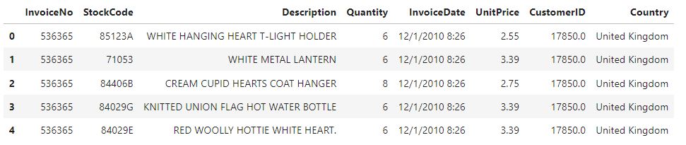
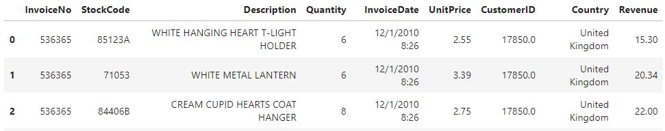
To get an initial glimpse of the data, we will load the CSV file into a Pandas DataFrame. We will display the first five rows of the dataset and examine its shape, revealing 8 columns and approximately 550,000 rows.
Now we can perform various aggregations and visualizations to explore intriguing characteristics of the data. We will discuss these aggregations and visualizations in detail in the following sections.
Transactions per Country
After examining the overall shape of the e-commerce dataset and establishing that we are dealing with customer invoices, our next step is to analyze the Country column. We are going to perform a quick analysis to determine the number of transactions in each of the 38 different countries present in the dataset. We will then group the transactions by country and print the aggregated data for a rapid overview. This will allow us to identify any notable patterns or trends. This aggregation reveals that there is a heavy emphasis on the United Kingdom in the dataset with around 500000 transactions, whereas other countries count at most 10000 transactions. The following pie chart illustrates this finding:
![]()
Exploring the Unit Prices
After examining the transactions per county, our next step will be to investigate the UnitPrice column, which represents the price in sterling for a single quantity of each item in an invoice. Our initial plan is to identify the highest and lowest unit prices in order to determine the range of values.
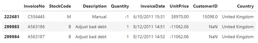
By analyzing the extreme values in the dataset, we can see that it contains not only regular product invoices but also special types of invoices. These special items have exceptionally large and negative unit prices, which will certainly impact our subsequent analysis. Therefore, we will focus our further analysis more on the actual products themselves.
After detecting these non-regular invoices, we are going to remove all invoices with special descriptions and prices. To obtain a preliminary list of items to remove, we will extract all items with a unit price above 1000 pound sterling.
![]()
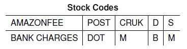
This step shows that only items with a non-numerical stock code have such high unit prices, while regular items generally have lower unit prices. We will then proceed to remove these items from the dataset. Furthermore, we will decide to exclude all invoices with a negative and zero unit price as they are also considered special and will be excluded from further analysis.
In the upcoming step, we will sort the dataset by unit price and display the items with the highest 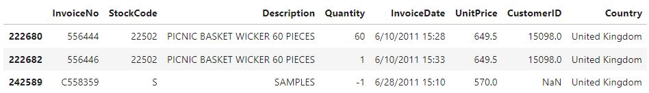
and lowest unit prices:
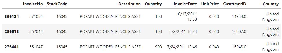
It seems that most of the special invoices are gone, but also that there are still non-regular items in the dataset as can be seen by the item with the stock code S. Given the already excluded items, we can note that the special invoices tend to have a stock code that only consists of letters compared to the numerical-only values or mixed stock codes of the other items. We will now further filter out invoices with stock codes that contain only letters which leaves us with the following list of removed item types:
With this, we conclude cleaning the dataset and also add an additional column containing the revenue that the invoice generated. We do this by multiplying the unit price with the quantity of the respective invoice. With the now cleaned and enriched dataset, we can take a closer look at the individual invoices.
Examining the Invoices Revenue
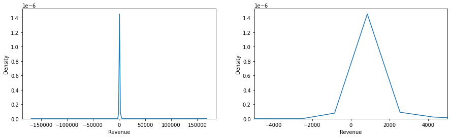
We are going to take the first step in obtaining a better understanding of the invoice’s revenue by computing the essential statistics:
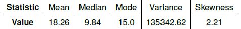
There is a common consensus in the literature that it always holds true that when the mean is greater than the median, we have a positive skew, and vice versa, we have a negative skew when the mean is smaller than the median. Computing the density plot of the revenue distribution gives us the following graph:
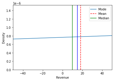
Furthermore, we are creating two additional density plots to obtain a comprehensive understanding of the distribution. The first plot reveals the presence of extremely large outliers in the dataset, resulting in a high variance. Due to the impact of these outliers, we must exercise caution when interpreting the computed statistics, as they are influenced by these extreme values.
An additional intriguing aspect of the dataset is the correlation between the unit price, quantity, and revenue of the invoices. This correlation produces the following heatmap:
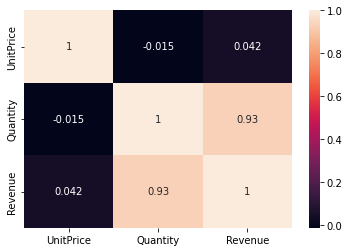
The heatmap shows that the unit price is not really correlated with either the revenue or the quantity but that the quantity shows a high correlation with the revenue. With this finding, it can be argued that the revenue is generated by a higher quantity of items per sale. Next, we will look at a scatterplot that shows the count of the individual unit prices:
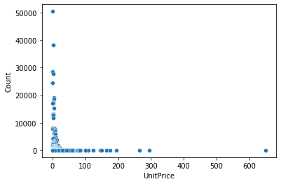
The plot shows that the majority of the items on the invoices have lower unit prices but that there are also some items with a larger unit price in the hundreds.
Inspecting the Items
After examining the individual invoices, we are now examining the statistics that we can derive by grouping the invoices based on their stock codes, or, in other words, aggregating data for each item. Furthermore, we are enriching the data with various new data points for each item. For example, we are calculating the percentage of returns, cash in sales, and net results.
Through this analysis, we are uncovering interesting insights. We have discovered that the item generating the highest net results is a three-story cake stand, which has generated over 160,000 pounds sterling in revenue. On the other hand, we have also identified the item with the lowest net results, which is a wooden advent calendar generating -45 pounds sterling. These examples highlight a significant bias towards positive net results, which is definitely advantageous for business operations.
To validate our findings, we are creating distribution plots that confirm the aforementioned bias toward positive net results.
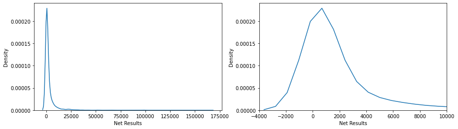
Similar to the revenue plots of the invoices, we are also dealing with extreme outliers here, but only in the positive direction, as shown by the extremely long right tail. After getting an overview of the individual items and observing the extreme tails, the next interesting point is to examine how much of the net results are generated by a specific percentage of items. The following graph displays this relationship:
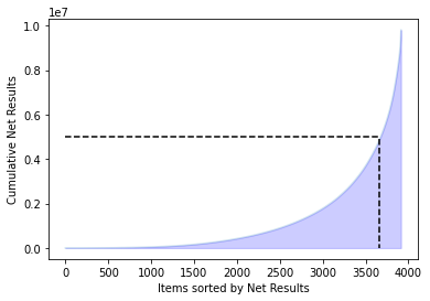
We are attempting to find the percentage of the items, resulting in a value of 6.34 percent. This indicates that the 248 items with the highest revenue, which account for 6.34 percent of the inventory, are generating approximately 50 percent of the total revenue.
Examining the Monthly Aggregations
After we have examined the specific items, we now focus on monthly aggregations in the analysis. In this step, we create a new DataFrame similar to the previous steps. To gain an initial understanding of the monthly aggregations, we create two boxplots that illustrate the distribution of sales and returns per month.
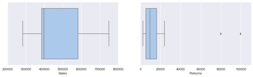
The boxplot of the sales shows that the sales range from just under 300000 to around 750000 with the majority of months having sales numbers from under 400000 to just under 600000. The boxplot of the returns shows relatively constant returns with two massive outliers. Interestingly these two massive outliers are December and January, which can be attributed to the fact that the winter holidays demand a more lenient return policy from the retailers. To further investigate the common saying that the winter season is the most important for e-commerce, we create a line plot of the sales, returns, and net results and a piechart of the net results. The line plot is thereby normalized so that all three datasets share the same y-axis.
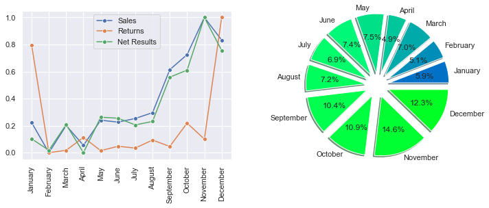
We can see that starting with August, the sales and net results start to ramp up and peak in November, with a smaller pullback in December. The returns are relatively constant throughout the year, except in December and January, which are extreme outliers. These findings coincide with other research, which shows that the winter months are the strongest for retail.
Conclusion
Visually exploring a dataset is vital to gaining important insights into a dataset. Like in the examined e-commerce dataset, data exploration can help to understand the data, to find trends, and to make decisions. For example, we saw that most of the transactions happened in the United Kingdom, so it is fair to assume that the retailer operates a UK-based business. Additionally, looking into the unit prices of the individual transactions revealed that the retailer deals with items that mostly are on the cheaper side but nonetheless generates revenue by selling larger quantities.
Also, by examining the net results, there was an interesting finding that around 6 percent of the items generated 50 percent of the net results. Although one year of data is perhaps not enough to make decisions about which items do perform well, if there were more data, it would be possible to reduce the catalog of items to the best-performing ones. This could eventually reduce storage costs and further increase the total results of the retailer. Lastly, by looking at the monthly aggregations of the transactions, it could be established that the winter months generate the most revenue and that the retailer should focus the business on these months.
Although a lot of this information can be retrieved by looking it up, for example, in the description of the official dataset, the main point of this paper was to show that all this information can be obtained solely by exploring and visualizing the dataset. The Jupyter Notebook containing the data exploration can be viewed in this GitHub repository.